


How to Match Your Rug to the Floor Colour, a Practical Guide
The floor is the largest surface in a room. The rug is the element that goes on top of it. The relationship between the two is fundamental to the final aesthetic result — and it isn't always intuitive. A rug that's beautiful on its own can look odd paired with the wrong floor, and vice versa. This guide gives you the practical rules for every type of floor, with concrete examples.
Light parquet (whitewashed oak, beech, natural spruce)
Light parquet is one of the most versatile bases there is. It doesn't "steal" colour from the rug and leaves room for any choice.
- What works: practically everything. Colourful rugs (kilim, Berber with blue/red decorations), rugs in earthy tones (camel, terracotta, rust), white or light-grey rugs for a minimal look, dark geometric rugs for sharp contrast.
- What to avoid: only very light beiges similar to the parquet colour — they risk "disappearing" into the floor.
- Tip: light parquet pairs beautifully with natural-wool Berbers in ivory and black — the same warm tone as the wood with the contrast of the pattern.

Dark parquet (walnut, wengé, mocha-stained oak)
Dark parquet creates a strong impact and requires more care when choosing the rug.
- What works: rugs in light and medium tones create the best contrast — ivory, off-white, light grey, beige, camel. Colourful kilims on an ivory ground work very well. Rugs with patterns that include the floor colour (burgundy, dark brown) also create continuity.
- What to avoid: very dark rugs (black, charcoal grey, dark brown) blend into the floor and lose definition at the edges.
- Tip: on walnut or wengé parquet, an ivory or light-grey wool rug creates a beautiful luminous contrast that enhances both.
Grey tiles (concrete effect, grey porcelain stoneware)
A grey floor is neutral par excellence — it's the base on which any rug works well, but with a few preferences:
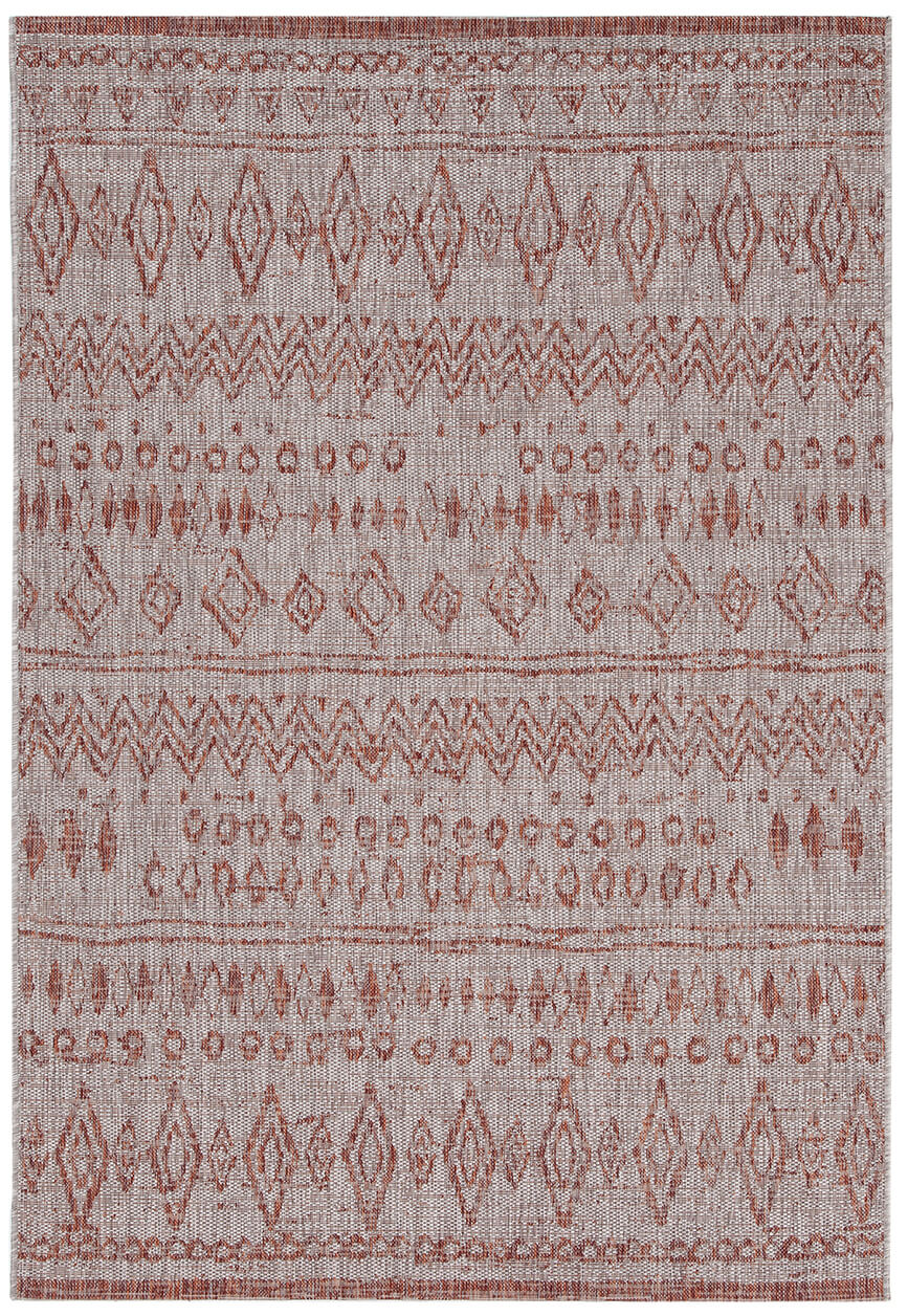
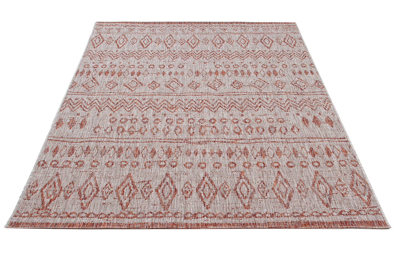
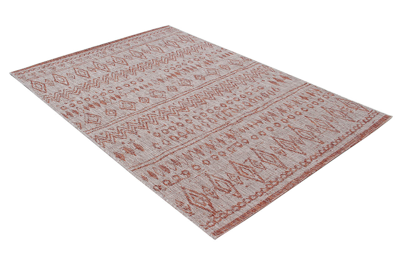
- What works: warm colours (terracotta, rust, mustard, olive green) create a chromatic contrast with the cool grey. Colourful kilim rugs or Berbers with dark geometric decorations stand out well. White and black also work for a contemporary look.
- What to avoid: light-grey rugs similar to the floor — same logic as light parquet.
- Tip: on a concrete-effect grey floor, an Afghan kilim with deep colours (red, blue, green) is the most striking pairing.
White or light tiles (bathroom, kitchen, Mediterranean settings)
- What works: any rug with colour — the white of the floor highlights everything. Colourful kilims, classic oriental rugs, Berbers with bold patterns.
- What to avoid: very light white or ivory rugs — they blend too much with the light tiles.
- Tip: a classic Persian rug (red/blue on an ivory ground) on white tiles is an evergreen pairing.
Concrete or resin floors (loft, industrial, modern home)
Concrete and resin floors are materials with a strong aesthetic — cold, raw, industrial. In these settings the rug must play with this aesthetic, not fight it.
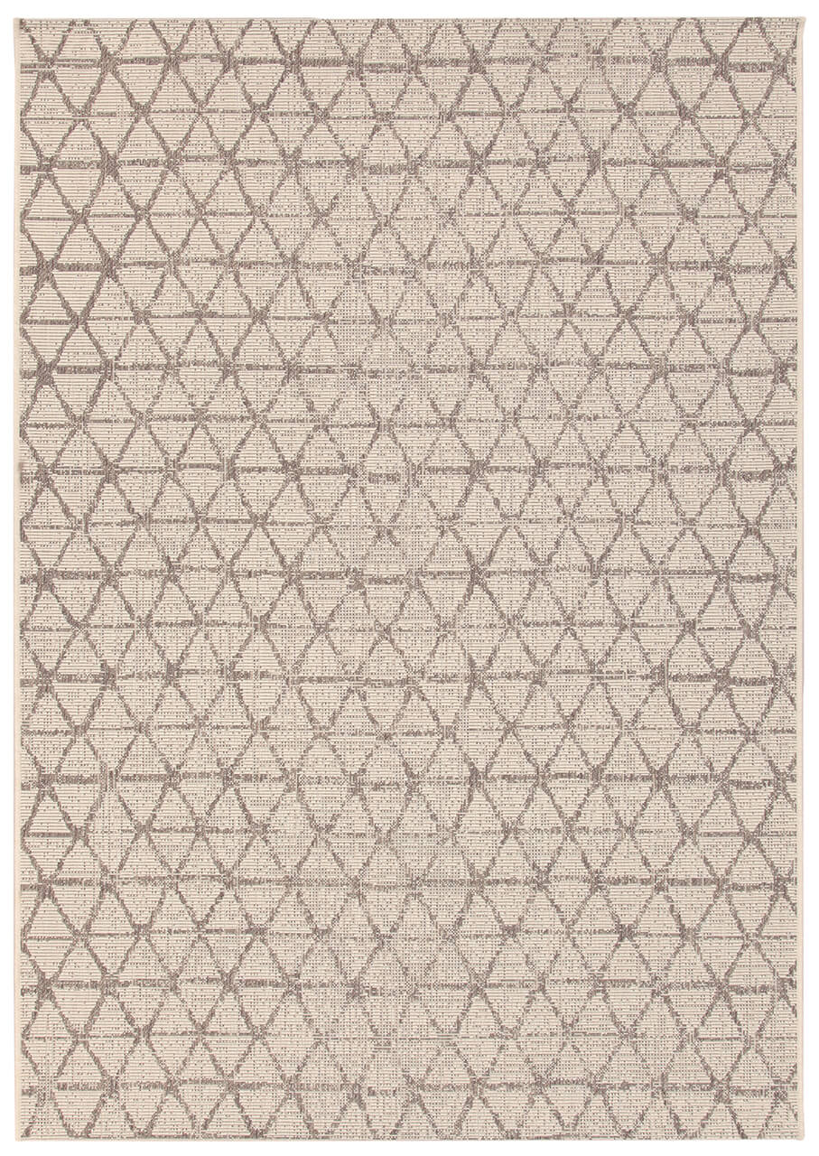
- What works: designer rugs with a contemporary pattern, the designer rugs in neutral or monochrome palettes. Colourful kilims also create an interesting contrast: the warmth of the kilim vs the coldness of the concrete.
- What to avoid: very classic or very "warm" rugs (a traditional Persian rug with elaborate borders) on concrete can look out of context.
- Tip: a large geometric rug in black/white or grey on a grey resin floor is the loft look par excellence.

Terracotta, brick and terracotta-tiled floors (country houses, rustic style)
- What works: terracotta is already rich in colour (orange-red-terracotta), so the best rugs are those that complement this palette. Kilims with the reds, oranges and greens of natural colours. Ivory Berber rugs with neutral patterns. Undyed natural-wool rugs (grey, écru).
- What to avoid: rugs with lots of light or cool blues — they create a chromatic dissonance with the warmth of the terracotta.
- Tip: on terracotta, natural-wool rugs in neutral colours are often the most elegant and "right" solution.
The general rule: contrast or complementarity?
Two opposite approaches, both valid:
- Contrast: dark floor + light rug, or light floor + colourful rug. Contrast is dynamic, lively, and clearly defines the zone.
- Complementarity: a warm floor + a rug in related warm tones (different but harmonious). The effect is more enveloping and homogeneous.
What never works: floor and rug in the same colour and the same intensity — the rug "disappears" and the zone isn't defined.
Rug-and-floor pairing, in summary
- Light parquet: everything works, just avoid a beige too similar to the wood
- Dark parquet: choose light or vividly colourful rugs for contrast
- Grey tiles: warm colours (terracotta, mustard) stand out well
- Concrete/resin: contemporary geometric rugs or colourful kilims are the most effective
- Terracotta: kilims with natural reds and oranges, or neutral wool
- General rule: avoid pairing floor and rug in the same colour and intensity


Share:
Taimany Rugs, History, Features and Why They're Among the Best Sellers